←Back to My Work
Introducing WCAG Accessibility Standards to the Wiser Home App
Company: Schneider Electric
Role: Design Manager / Senior Product Designer
Duration: 12 months
Team: Product, engineering, accessibility and design
Platform: Mobile app
Problem Statement
Following the introduction of new accessibility legislation, the Wiser Home app needed to meet WCAG accessibility standards for the first time. The challenge was to identify and address accessibility gaps within the existing product, while working within the constraints of a live app and established design patterns.
Constraints and Context
The project was driven by new accessibility legislation requiring the app to align with WCAG standards. As an existing, mature product, it was not feasible to address all accessibility gaps at once, so a phased approach was taken. The initial scope focused on a subset of key WCAG criteria applied to the most frequently used areas of the app, allowing the team to make meaningful progress and set the direction quickly.
My Role
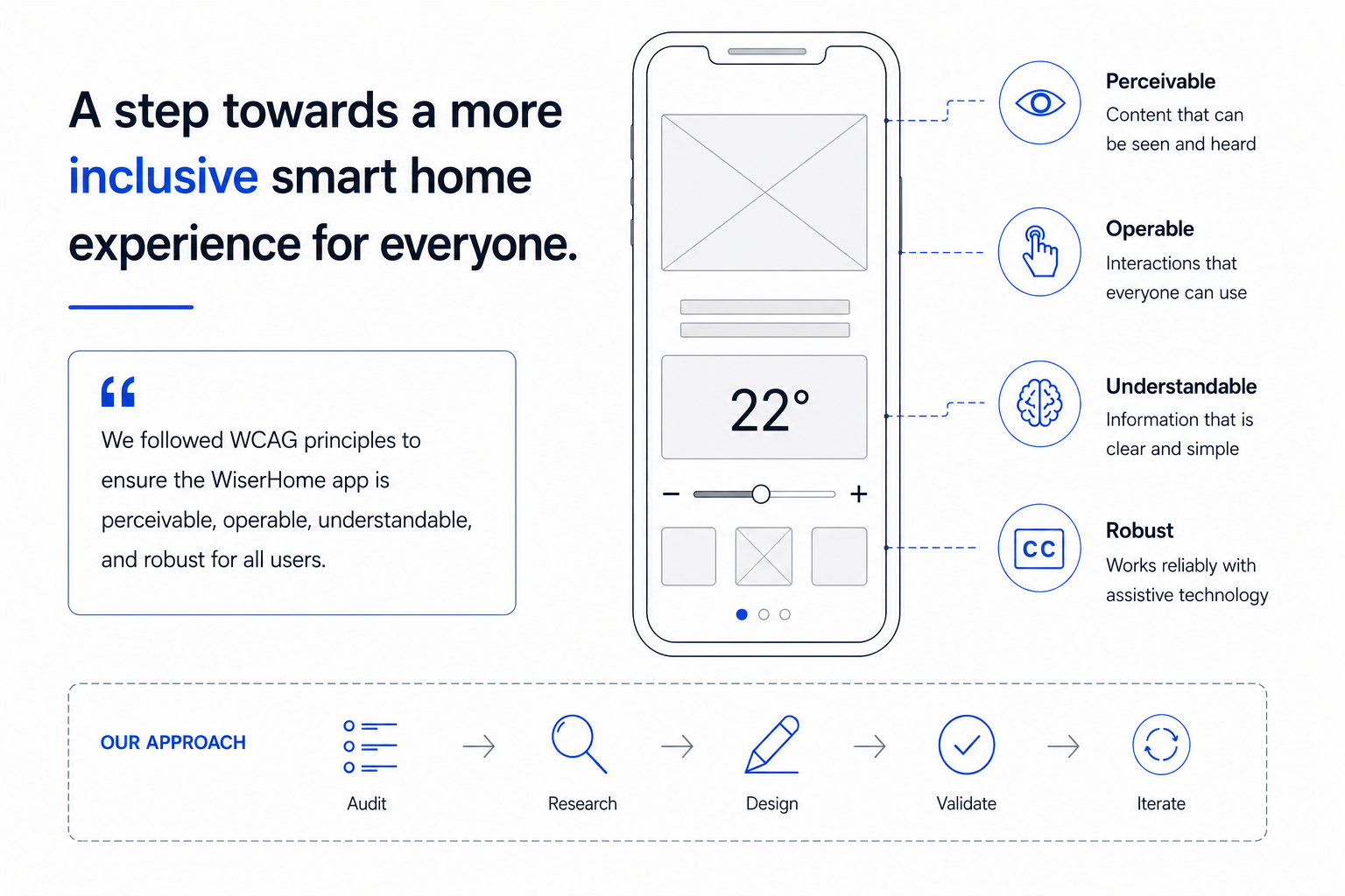
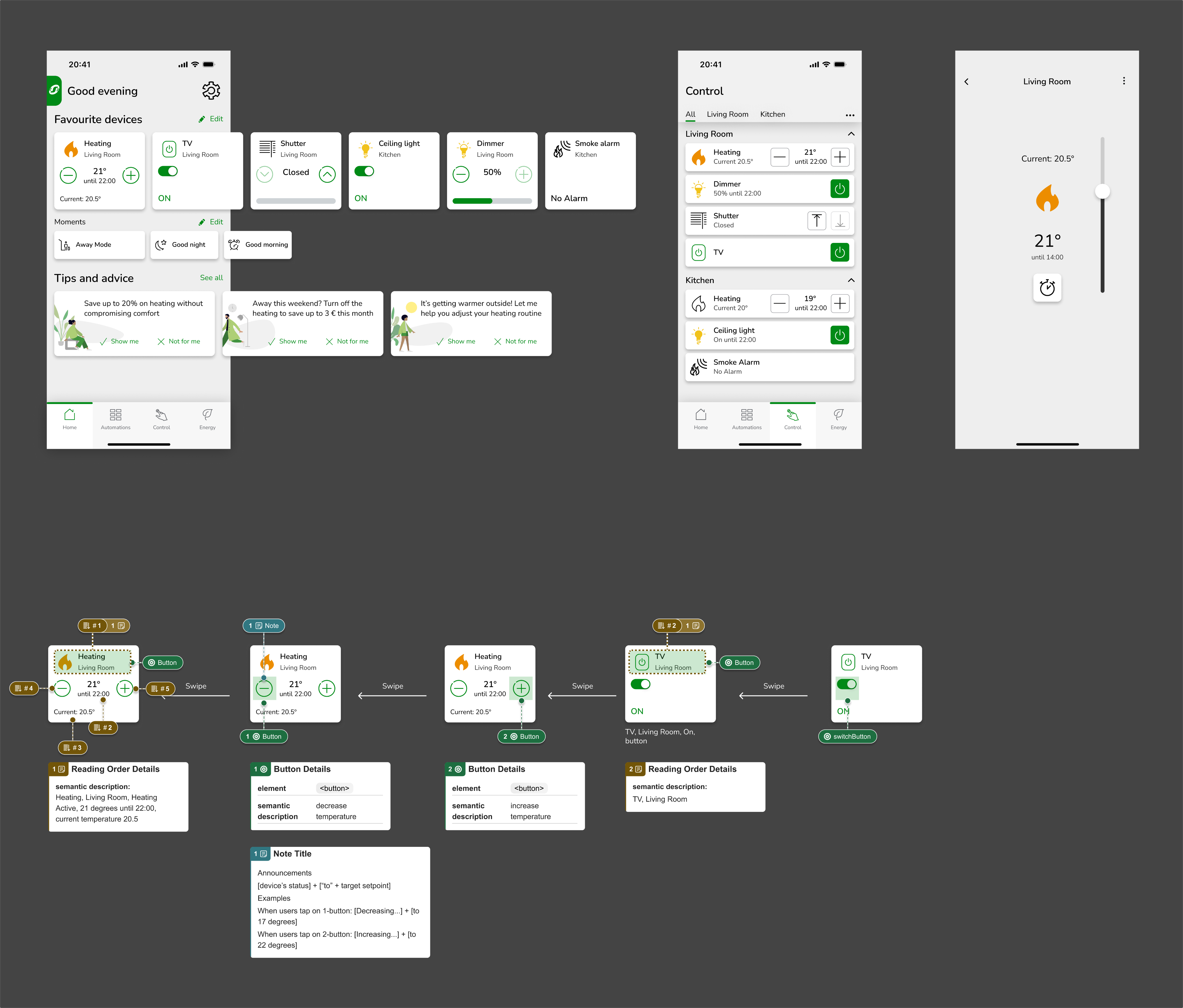
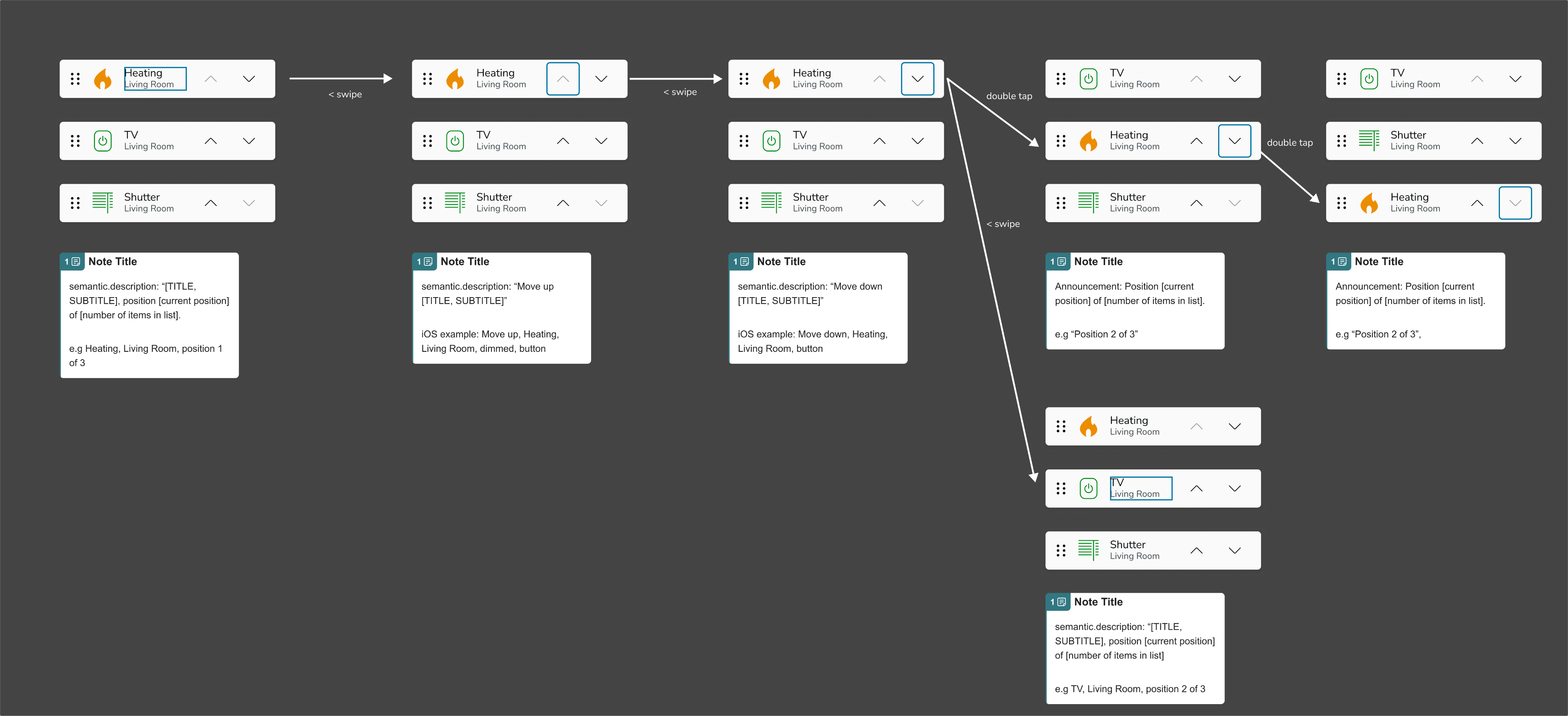
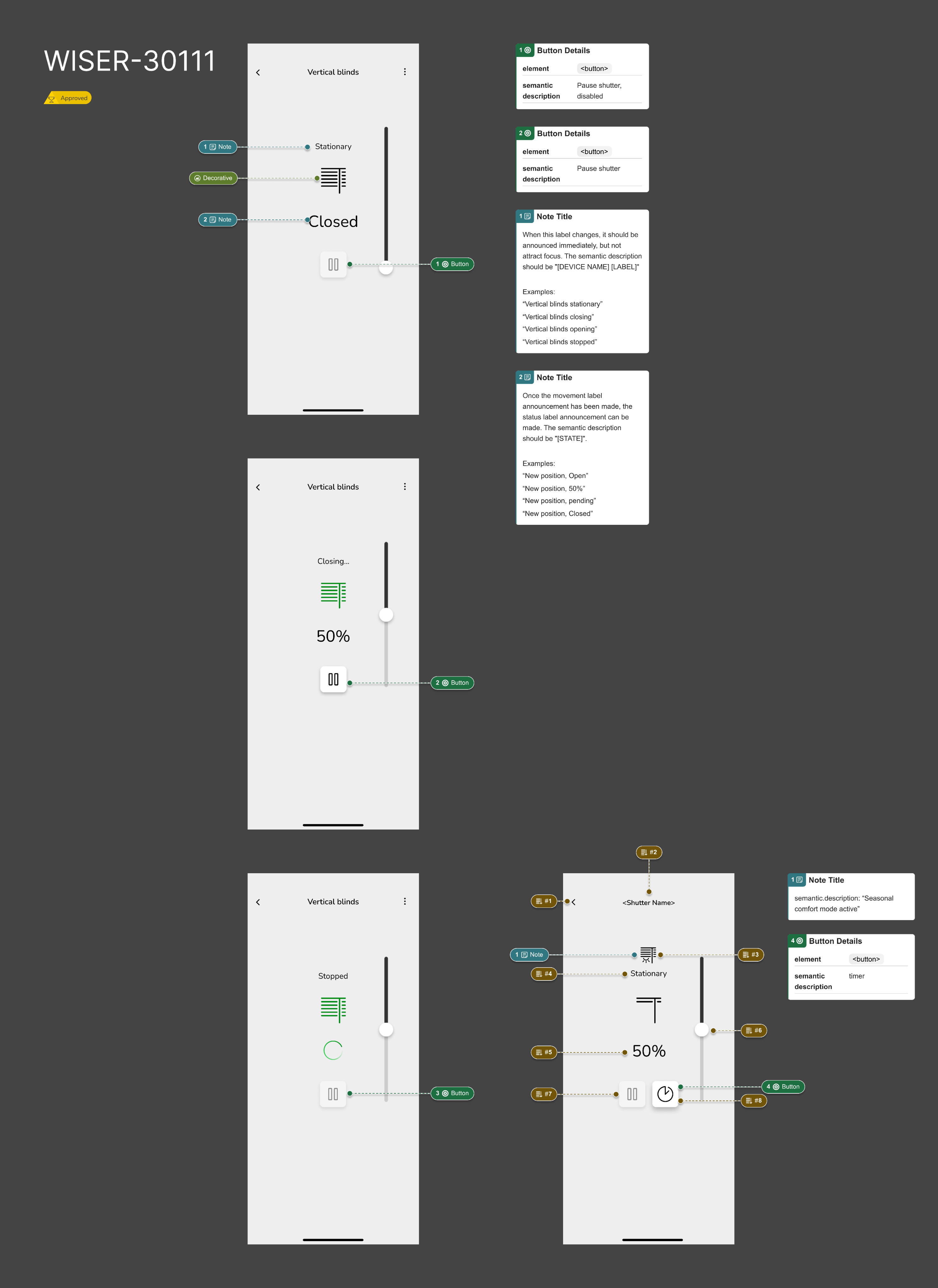
I was responsible for documenting and annotating designs to support accessibility implementation. This included defining accessible names, setting expectations for keyboard navigation, and documenting touch gesture behaviour. My work helped translate WCAG requirements into clear, actionable guidance for engineers working on the platform.
Approach
The work began with a full accessibility audit conducted by an external specialist, which provided a clear baseline against WCAG requirements. Given the size and maturity of the existing app, it was agreed that addressing all findings in a single phase would not be feasible.
Instead, a phased approach was adopted. The initial focus was on a defined set of high‑impact WCAG criteria applied to the most frequently used areas of the app, including the home screen and primary control screens. This allowed the team to deliver meaningful improvements quickly while reducing delivery risk.
My focus during this phase was on translating audit findings and WCAG requirements into clear, implementation‑ready design guidelines. Designs were documented and annotated with accessibility expectations, including accessible names, keyboard navigation behaviour, and touch gesture requirements. Particular attention was given to platform differences to ensure accessibility intent was consistent while aligning with native iOS and Android behaviours.
By concentrating on core journeys and establishing clear accessibility documentation patterns, this phase also laid the groundwork for broader accessibility improvements across the app in future iterations.
Key Decisions
Stabilise rather than rebuild the design systemGiven the age of the product and the fragmented state of the existing design system, a full redesign was deliberately avoided to reduce risk and prevent further inconsistency.
Limit scope to high‑impact areas and componentsAccessibility improvements focused on the most frequently used screens and primary controls, where clearer patterns would deliver the most value.
Document behaviour where components could not be centralisedAs core components such as buttons were not implemented through a single reusable template, accessibility requirements were captured through detailed design annotations rather than global component changes.
Avoid introducing parallel components without governanceNew accessibility‑specific component variants were not added, as this would have increased fragmentation and technical debt.
Treat this phase as a foundation for future system improvementsDecisions prioritised clear, reusable patterns that could be scaled once the design system matured, rather than short‑term fixes.
Solution
The solution focused on introducing a clear and minimal Elko‑branded layer on top of the existing Wiser Home app, prioritising ease of implementation and long‑term maintainability. Brand changes were deliberately limited to a small set of high‑impact touchpoints, including colour application, logo usage, splash screen, and App Store assets, allowing the core experience to remain unchanged. Additional design-themes and tokens were created in the design system to accommodate easy switching between brands.
While the resulting branding was intentionally restrained, this approach aligned with the project’s primary constraints and supported future product development without creating additional engineering overhead. Although it did not represent the strongest or most expressive version of the Elko brand, the final design reflected the brand’s evolving direction as it becomes increasingly aligned with the wider Schneider brand strategy, moving away from Elko as a fully independent identity.
Outcome and Impact
Although the changes are not yet live, the project has established the first WCAG‑aligned accessibility patterns within the app. Core screens and control areas have been updated and documented, creating a shared reference point for design and engineering.
Ongoing user testing is validating these improvements and informing refinements ahead of release. Beyond the immediate changes, the project has helped embed accessibility considerations into design documentation and delivery workflows, supporting continued progress toward broader compliance.
What I Would Do Differently?
The product launched in 2016 and the design system evolved organically during its early years. At that time, I was the sole, junior designer, and the system lacked formal structure, component governance, and shared patterns, particularly for foundational elements such as buttons. As a result, components were often created in isolation and could not be updated consistently in a single place.
Although this project took place in Q4 2025, it was shaped by those earlier decisions and the technical reality of a long‑lived product. With my current understanding of design systems, I would prioritise stabilising and standardising core components much earlier, in close alignment with engineering, to allow changes such as accessibility improvements to scale more efficiently across the app.
This project reinforced the importance of treating a design system as a product in its own right, especially when introducing systematic requirements like accessibility.